
WooCommerce Product Image Size: The Optimal Dimensions for Store Photos
The right WooCommerce product image size gives your store sharp photos, fast loading speed, and a consistent layout across every device. Clear product visuals help customers trust what they see, understand details quickly, and make confident buying decisions.
This guide explains the dimensions that work best in 2026 and shows you how to set them correctly for your theme. Key things you will learn in this guide:
- The ideal dimensions for different store types
- How to set image sizes step by step inside WooCommerce
- How to optimize product photos for speed and clarity
- How to fix blurry, stretched, or slow-loading images
You will find everything you need to create sharp, consistent, and fast product images for your WooCommerce store.
Quick Answer: The Best WooCommerce Product Image Sizes in 2026
The best WooCommerce product image size depends on clarity, speed, and how your theme displays photos. Sharp images help customers inspect details, while optimized dimensions keep loading times fast. Below are the recommended sizes that work well for most stores in 2026.
Recommended image sizes for WooCommerce:
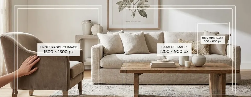
- Single product image: 1200 × 1200 px (ideal for zoom and retina screens)
- Catalog image: 1000 × 1000 px (shop page, categories, related products)
- Thumbnail image: 600 × 600 px (small previews, widgets, product grids)
- Aspect ratio: 1:1 square works best for consistency across layouts
- File format: WebP for most images, JPG for lifestyle shots, PNG only for graphics
- Target file size: Under 150 KB for Single Product Image when possible
The sizes above balance quality and performance across mobile, desktop, and high-DPI displays. They also work smoothly with popular themes like Astra, Flatsome, Storefront, and block themes.
Why Product Image Size Matters in WooCommerce
Product image size affects how customers see your items, how fast your pages load, and how consistent your store appears across devices. A correct size keeps photos crisp, prevents distortion, and supports better overall performance.
Key reasons product image size matters:
- Clear images help customers understand product details and feel confident before buying
- Correct dimensions prevent stretched or cropped photos across different layouts
- Balanced sizes improve loading speed on mobile and desktop
- Proper resolution supports zoom features and high-DPI displays
- Consistent aspect ratios create a cleaner and more professional product grid
- Optimized images reduce bounce rates and support stronger conversions
A well-chosen image size strengthens product presentation and improves the shopping experience across your entire WooCommerce store.
Understanding WooCommerce Image Types
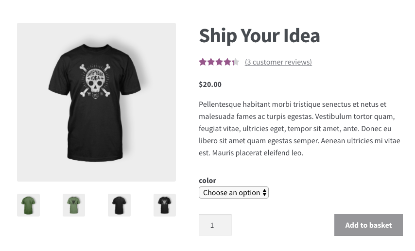
WooCommerce uses three main image types to display products across different parts of your store: single product image, catalog image, and thumbnail image. Each type serves a specific purpose, and each one responds differently to theme settings, cropping rules, and layout changes:
- Single product image appears on the main product page and carries the most detail. Customers rely on it for zooming, examining textures, and checking product accuracy.
- Catalog image appears on the shop page, product grids, category listings, and related items. These images shape the first impression of your store and influence whether the layout looks even and organized.
- Thumbnail image appears in smaller components such as widgets, mini carts, upsells, and product blocks. Even though the size is small, the clarity still matters because blurred thumbnails reduce trust.
How themes modify image dimensions?
Themes influence how these image types appear. Some themes force strict cropping, others scale images responsively, and many override the default WooCommerce dimensions entirely. This means two stores using the same images can display them differently depending on the design system of the theme.
How block themes handle image sizes differently?
Block themes introduce a new layer of control through WordPress templates and container-based design rules. Instead of relying on the old Customizer settings, block themes set image behavior through block width, layout structure, and fluid scaling. This approach increases flexibility but also requires consistent aspect ratios to avoid unpredictable cropping across devices.
Aspect ratio vs resolution: the core principle behind clear images
Aspect ratio defines the shape of the image, while resolution defines the level of detail.
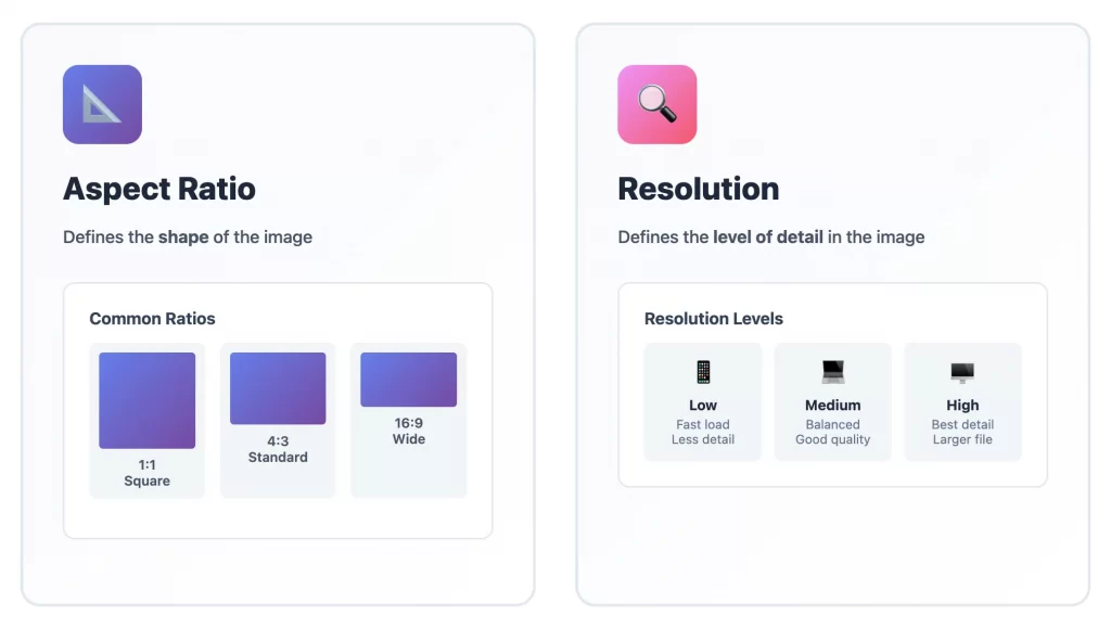
A correct ratio prevents stretching or cropping issues, and a suitable resolution keeps images sharp without slowing the site. Both elements work together, and both matter when choosing the best WooCommerce product image size.
Beyond Static Images: Video & 3D
Modern WooCommerce galleries are multimedia containers. While you cannot “size” a video like an image, its thumbnail must match your image aspect ratio to prevent grid misalignment.
- Video Thumbnails: If you embed YouTube or Vimeo videos in your gallery, ensure the video placeholder image uses the same dimensions (e.g., 1000 × 1000 px) as your static photos.
- 3D Models (.glb/.usdz): 3D viewers often float over the main image area. Ensure your underlying “Master” image is high-resolution (2048 px) to match the fidelity of the 3D model when the user switches views.
Recommended WooCommerce Product Image Sizes by Store Type
Each WooCommerce store displays images differently, and no single size fits every theme or layout. Theme design, zoom features, aspect ratio, and the level of detail in each product all influence how your images appear.
The sizes below work well as strong starting points, but they remain recommendations, not fixed rules. You can adjust them based on your products and how your WooCommerce theme handles layout and scaling.
Fashion & apparel stores
Fashion stores in WooCommerce rely heavily on clear product photos because customers check fabric quality, color accuracy, fit, and small details. WooCommerce themes often stretch apparel images across wide containers, so your images must stay sharp in both grid and full-width layouts.
WooCommerce product image size for fashion stores:
- Single product image: 1200 × 1500 px or 1500 × 1500 px (fits well in product galleries, sliders, and full-width blocks in themes like Flatsome)
- Catalog image: 1000 × 1250 px or 1200 × 1200 px (keeps grid layouts consistent in Storefront and Astra)
- Thumbnail image: 600 × 600 px (remains clear in small areas such as upsell blocks or mobile filters)
- Aspect ratio: 4:5 or 1:1
Fashion stores often use large gallery layouts and zoom features, and WooCommerce scales Single Product images across devices. A taller or square image fills product cards cleanly and avoids empty white gaps in catalog grids. These dimensions also allow WooCommerce to generate crisp scaled versions for mobile screens without distortion.
Electronics stores
Electronics stores in WooCommerce need precise and sharp images because customers evaluate small details such as ports, buttons, surfaces, and screen quality. WooCommerce scales electronics photos across multiple display areas, so your images must hold clarity at every size.
WooCommerce optimal product image size for electronics stores:
- Single product image: 1200 × 1200 px or 1400 × 1400 px (stays sharp in WooCommerce zoom and high-DPI layouts)
- Catalog image: 1000 × 1000 px (shows clean product cards in grid themes such as Astra or Kadence)
- Thumbnail image: 600 × 600 px (ensures sharp previews in related products and block layouts)
- Aspect ratio: 1:1
Electronics usually display best when centered, and WooCommerce grids work naturally with square images. A higher resolution supports WooCommerce’s default zoom behavior and keeps images crisp even when themes stretch them in wider containers. This setup creates uniform product cards and prevents distortion.
Home & furniture stores
Furniture and home décor stores rely on large, detailed visuals and lifestyle images that show scale, texture, and placement. Many WooCommerce themes stretch these images into wide blocks, so the files need strong clarity, especially on large screens.
Recommended image sizes for home and furniture stores:
- Single product image: 1500 × 1500 px or 1600 × 1200 px (provides enough detail for room scenes and texture close-ups)
- Catalog image: 1200 × 1200 px or 1200 × 900 px (fits landscaped product cards commonly used in modern WooCommerce themes)
- Thumbnail image: 600 × 600 px
- Aspect ratio: 1:1 or 4:3
Furniture photos often appear in full-width blocks, sliders, or comparison grids. WooCommerce automatically generates smaller versions, but the original file must have enough resolution to stay sharp on wide layouts. The 4:3 ratio often fits room scenes better and avoids excessive cropping in catalog grids.
Dropshipping stores
Dropshipping stores receive images from suppliers with inconsistent sizes, ratios, and quality. WooCommerce needs clean, consistent dimensions to avoid uneven product grids and mismatched catalog cards.
Recommended image sizes for dropshipping stores:
- Single Product Image: 1000 × 1000 px or 1200 × 1200 px (works safely with imported images from AliExpress, CJ Dropshipping, and other sources)
- Catalog Image: 900 × 900 px or 1000 × 1000 px
- Thumbnail Image: 600 × 600 px
- Aspect Ratio: Match the supplier’s original ratio when possible
WooCommerce grids look messy when suppliers use different aspect ratios. By using a square or near-square format, you help WooCommerce standardize the grid and reduce distortion. These dimensions also support bulk import tools and speed optimization plugins without losing clarity.
Digital products (mockups)
Digital products require precise, high-resolution images that accurately show fonts, shapes, textures, and layout elements. WooCommerce often stretches these images across both product pages and catalog grids, so clarity is essential.
Recommended image sizes for digital product stores:
- Single product image: 1400 × 1400 px or 1600 × 1600 px (supports zoom and retina displays used in many WooCommerce designs)
- Catalog image: 1200 × 1200 px (aligns cleanly in block themes and classic grid layouts)
- Thumbnail image: 600 × 600 px
- Aspect ratio: 1:1
Digital items rely on sharp visuals, and WooCommerce generates multiple scaled versions of each image. A high-resolution square source ensures that all variations stay crisp, whether in grids, related products, or mobile layouts. Square branding mockups also center well across WooCommerce themes.
Google Shopping & Merchant Center Image Requirements
If you plan to run Google Shopping ads, your images must adhere to strict policies that differ from your store’s design. An image that looks great on your homepage might get your product disapproved in Google Merchant Center.
Critical GMC Rules:
- No Overlays: Google rejects images with “Sale” badges, logos, or text overlays (e.g., “Free Shipping”).
- Solid Backgrounds: While your store might use grey or transparent backgrounds, Google prefers solid white (#FFFFFF).
- Minimum Size: Apparel products require at least 250 × 250 px; all other products require 100 × 100 px. However, the recommended size for high visibility is 800 px or larger.
- Strategy: If your store uses watermarked images, use a Product Feed plugin that allows you to map a “clean” version of the image to Google while keeping the branded version on your site.
How to Set Product Image Sizes in WooCommerce
WooCommerce lets you control product image dimensions directly inside the WordPress Customizer. These settings shape how your product photos appear across Single Product pages, catalog grids, mobile layouts, and widgets. The steps below help you set the correct size without creating distortion or blurry images.
Step 1. Open the WooCommerce product image settings
Go to Appearance → Customize → WooCommerce → Product Images.
This panel controls the main image width, thumbnail width, and cropping behavior.
Step 2. Set the main image width
The main image width defines how large your photos appear on Single Product pages.
A width between 1200 px and 1500 px keeps images sharp and supports zoom features across most WooCommerce themes.
Step 3. Set the thumbnail width and choose the cropping style
Thumbnail width shapes images in shop grids, category pages, and related product sections. A width between 600 px and 900 px provides a clear, balanced layout.
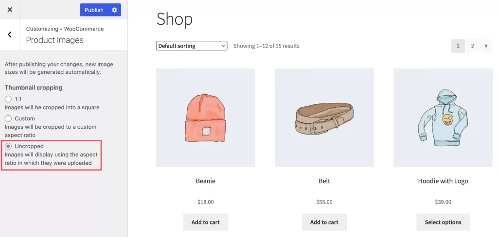
Cropping options include:
- Uncropped: keeps original ratio
- Square (1:1): fits most themes
- Custom ratio: adapts to unique product shapes
Step 4. Save changes and regenerate thumbnails
WooCommerce does not update old images automatically. You can use a tool like Regenerate Thumbnails so every product photo matches your new settings.
Step 5. Check for theme overrides
Some themes apply their own image rules:
- Flatsome uses UX Builder controls
- Astra adjusts ratios in Customizer
- Block Themes handle images through template blocks
Reviewing theme behavior ensures your settings appear correctly on all pages.
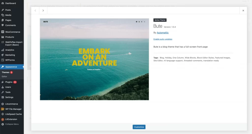
Other Method: Setting Sizes in Block Themes (Site Editor)
If you are using a Block Theme (e.g., Twenty Twenty-Five), you won’t find image settings in the Customizer. Instead, image rendering is controlled by the Site Editor and the theme.json file:
- Global Layout Settings: Navigate to Appearance → Editor → Styles → Layout. Here you define the Content and Wide dimensions. WooCommerce product images in the Product Catalog template often inherit the
Contentwidth. Ensure your content width (e.g., 1200px) is wide enough to accommodate your grid columns. - Single Product Template: Go to Appearance → Editor → Templates → Single Product. Select the Product Image Block. In the block settings sidebar, you can often toggle between “Crop to fit” or “Cover” depending on the block styling. Note that Block Themes rely more on CSS
object-fitrules than physical image resizing. - Using
theme.jsonfor Aspect Ratios: Advanced users can define specific aspect ratios in thetheme.jsonfile undersettings.dimensions.aspectRatios. This ensures that even if a client uploads a portrait image, the block editor forces it into a 1:1 square container on the frontend.
How to Optimize Images for Speed and SEO
WooCommerce stores perform best when product images stay sharp while loading quickly on all devices. Google recommends a balance between resolution, compression, and delivery method. The points below highlight the most effective ways to optimize images without lowering visual quality.
1. Use the right resolution for retina and mobile screens
High-DPI screens need clear images, but mobile devices benefit from smaller downloads. A source image between 1200 px and 1600 px gives WooCommerce enough room to generate sharp variations for all breakpoints while keeping file sizes manageable.
2. Choose efficient image formats and safe compression levels
Google recommends modern formats for speed.
- WebP works well for most product photos
- JPG suits lifestyle scenes
- PNG fits graphics or transparency
A compressed file under 150 KB helps the store load quickly without losing clarity.
3. Improve delivery with a CDN
A CDN speeds up your WooCommerce store by placing product images on servers closer to shoppers. This reduces load time and helps your product pages feel smoother, especially for customers visiting from different regions. Services such as BunnyCDN and Jetpack CDN work well for most stores.
Cloudflare is also widely used, but it faced outages this year. A simple fallback plan or a backup image delivery option helps your store stay stable during unexpected downtime.
4. Rely on WooCommerce lazy loading and srcset scaling
WooCommerce uses lazy loading to delay images that sit below the fold. Browsers load these images only when shoppers scroll, which reduces the initial page load time.
If native lazy loading causes issues, you can disable it globally at the theme level. Add the following code to your theme’s functions.php file or to a custom functionality plugin:
add_filter( 'wp_lazy_loading_enabled', '__return_false' );This code disables WordPress native lazy loading for images and iframes across the entire site.
The srcset feature also helps by selecting the right image size for each device, so mobile users receive smaller files while larger screens receive higher-quality versions.
5. Regenerate thumbnails after changing sizes
WooCommerce creates several image sizes in the background, and these versions need to match your latest settings. A quick regeneration updates older images so they display correctly in product grids, category pages, and mobile layouts. A tool such as Regenerate Thumbnails handles this process safely and keeps your store layout consistent.
6. Metadata and color profile considerations
Extra metadata increases file size without improving how your product appears online. Removing unnecessary EXIF data keeps files lighter. Setting all images to the sRGB color profile ensures consistent colors across browsers, devices, and WooCommerce themes.
7. Leverage Structured Data (Schema) for Visual Search
In 2026, visual search tools like Google Lens rely on structured data to identify products. Ensure your product images are wrapped in Product and ImageObject schema.
This markup tells Google explicitly, “This image represents a product with the price X and stock status Y.” Most SEO plugins handle this automatically, but you must ensure they point to the largest variant of your image (the 1200px+ Single Product image), not the thumbnail. This ensures your product appears clearly in “Rich Image” search results.
Troubleshooting Common WooCommerce Product Image Issues
WooCommerce stores can display product images incorrectly when sizes, ratios, or theme settings do not match. The points below highlight the most common issues and show you how to fix them quickly.
1. Images look blurry
Blurry images usually come from low-resolution uploads or images that WooCommerce enlarges to fit the layout.
You can fix this by uploading higher-resolution files and setting a main image width between 1200 px and 1500 px. Checking your theme’s scaling rules also helps prevent unwanted stretching.
2. Images look stretched or distorted
Stretched images appear when the aspect ratio does not match your theme’s product card or gallery layout.
You can fix this by choosing a stable ratio such as 1:1, adjusting cropping settings in WooCommerce, or uploading images that match the theme’s recommended proportions.
3. Product photos load slowly
Large file sizes often slow down loading. You can improve speed by using WebP or compressed JPG files under 150 KB and delivering images through a CDN. This combination reduces weight without lowering visual quality.
4. Lazy loading causing layout shifts
Lazy loading sometimes delays images at the top of the page. You can reduce layout shifts by disabling lazy loading for the first product image or adjusting theme settings so the container holds a fixed height before the image loads.
5. Theme overrides not applying
Some WooCommerce themes apply their own WooCommerce product image size rules and ignore global settings. You can fix this by checking the theme’s documentation, reviewing its image controls, or adjusting the ratio and container settings inside the theme panel. Block themes may require template edits in the Site Editor.
WooCommerce Product Image Size: FAQs
How to change product image size in WooCommerce?
You can change image sizes in Appearance → Customize → WooCommerce → Product Images. Adjust the main image width, set the thumbnail width, and choose the cropping style. After saving, regenerate thumbnails so older images match the new settings.
What size should my WooCommerce catalog or shop page images be?
A catalog image size between 1000 px and 1200 px works well for most themes. This size keeps product grids sharp while loading quickly on mobile and desktop.
How to fix WooCommerce image size issues?
Image issues usually come from mismatched aspect ratios, old thumbnails, or theme overrides. Checking your cropping settings, uploading higher-resolution files, and regenerating thumbnails often solves the problem.
Which image format is best for WooCommerce: JPG, PNG, or WebP?
WebP usually delivers the best balance between clarity and file size. JPG works well for lifestyle scenes, while PNG suits graphics or transparent backgrounds. A file under 150 KB helps your store load faster.
How should I size my product images for WooCommerce if I use a zoom-on-hover effect vs a click-to-zoom effect?
Zoom-on-hover needs higher resolution, so a Single Product Image between 1400 px and 1600 px performs well. Click-to-zoom can use slightly smaller images because the zoom window usually opens in a modal and does not stretch the layout.
Final Recommendations for Perfect WooCommerce Product Image Sizing
The best WooCommerce product image size depends on clarity, performance, and how your theme displays each photo. A few core principles help you keep your store sharp, consistent, and fast across all devices.
Key recommendations to follow:
- Upload high-resolution images between 1200 px and 1600 px for Single Product pages
- Use a stable aspect ratio such as 1:1 or 4:5 to avoid distortion in product grids
- Keep file sizes low by using WebP or compressed JPG images under 150 KB
- Regenerate thumbnails after changing sizes to keep your layout consistent
- Review your theme’s documentation because each theme may handle image sizing differently
- Check how your images appear on mobile, where most customers browse
A clear, well-optimized image set gives your store a professional look and improves the overall shopping experience. When your WooCommerce product images stay sharp and fast, your customers feel more confident, and your store performs better.
And now, let’s design what’s next!
At LitOS, we help brands build faster, better WooCommerce stores with smart design, clean product layouts, and practical technology. From first-time setup to full store redesign, we make your WooCommerce experience smooth, scalable, and easy to manage.
Talk to our WooCommerce experts
