How many consumers walk into a giant store, a supermarket, for instance, wasting hours of searching and leave with empty hands due to the we-don’t-have-that-kind-of-stuff problem?
At that time, the only choice for you is to go somewhere else. And if the following stores don’t have it, the wild goose chase begins! But this soon becomes infuriating. Disappointed, you may claim to yourself, “I should’ve looked for it online instead”.
Nowadays, you can find anything you want online and get it delivered in just a few clicks. This is why retail eCommerce now exceeds $3.5 trillion worldwide!
Online shoppers may have certain requirements when they buy online, such as store concepts, product displays, and various payment methods. So if your store isn’t live up to their expectations, there would be no deal.
That’s the reason why user experience (UX) is of great importance. In this article, we’re going to look at eight of the best UX improvements to help boost your sales and create your loyal customer profile.
What is User Experience?
User experience (UX) encompasses every interaction a customer has with your brand. This includes a wide range of features such as website, products, and customer service. But it also incorporates the peripheral aspects of your business, such as ads, content, social media, and email marketing.
Simply speaking, it is how your customers experience your business as a whole. So it’s your responsibility to build a good reputation, besides giving the customers what they want.

Now businesses are becoming increasingly digitized, therefore maintaining an effective online customer experience is essential. This is equivalent to optimal connectivity, workplace agility, and secure use of data throughout your UX design process.
One important aspect of UX is ensuring that your website is optimized for search engines. This is where SEO for webflow comes in. By implementing effective SEO strategies, you can improve your website’s visibility and attract more organic traffic, ultimately enhancing the overall user experience.
The Customer Journey
Imagine capturing a picture of the local supermarket, what do you see? You’ve got a fruit and vegetable stall and maybe a flower stall next to it. Every aisle is clearly labeled, and every product is categorized in each.
As you meander your way through the store you notice special offers and new products to try. Then as you make your way to the end you find the checkouts lined with obligatory treats. The thing is, supermarkets all over the world follow this type of layout. Because it’s highly effective!
Flowers and fruit and veg are at the front because it gives the instant impression of fresh produce. Then you’ve got the strategically placed signs and offers that allure you to buy more on your way to the checkout. The last hurrah comes from that last-thought, quick-buys that you didn’t need, but who cares, treat yourself.
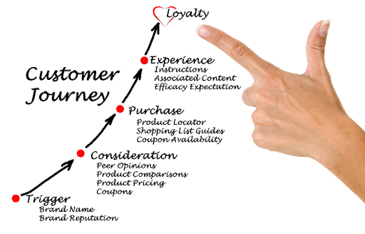
The point is that this tried and tested layout not only helps people find what they need but also encourages them to spend more money. And customers subconsciously expect this, both in supermarkets and online stores.
If you don’t meet their expectations of how a store should be, they may get confused, distracted, or agitated. And when it comes to design, if the content or layout is not attractive, about 38% of people will stop engaging with the website.
So, now let’s take a look at those techniques for improving your website design and UX to give the customer exactly what they’re after.
1. Make Them Feel at Home
First impressions are everything, so your homepage had better dazzle them deliriously. A clean layout that’s easy to read and navigate is crucial to hold their attention throughout. Think of it like a storefront that lets them walk through the door. If they can’t find that door, they’ll pass.
Your homepage is the shopfront that showcases your wares. What’s on offer, where to find items, how to inquire. All of these should be clear and well-presented. They’ll expect your logo to be at the top-left, the navigation bar at the top (and bottom), and the cart at the top-right.
When it looks attractive and right-functioned as it should, buyers will stay. It’s about helping them on their journey in a way they’ve come to expect.
2. Flight of the Lost Navigator
As mentioned earlier, not being able to find what they’re after is a good reason to take flight. Having a lack of signage, or even too much of it both cause further confusion. Keep it clear, balanced, and consistent throughout the whole site.
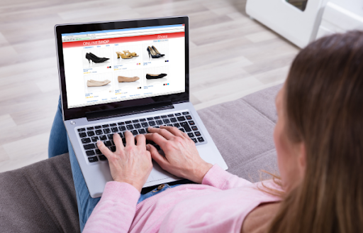
Some good methods for this are to use visual clues such as familiar icons, matching color schemes, search bars, and easy-to-read labels. It doesn’t just make the customer journey much easier, but it gives them a more pleasant experience, so they may come back again.
3. Lead the Way
Let’s say you’re going on a journey to somewhere you’ve never been before. You could use a map, or you could let a GPS tracker guide you every step of the way. It makes the process so much easier and you’re much less likely to get lost.
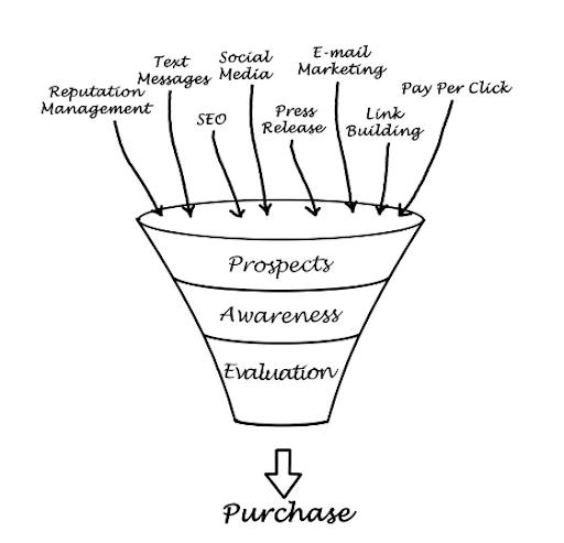
Similarly, you can direct customers through a funnel that subtly leads them to make a transaction. It starts with an engaging landing page that sparks their interest in your product or service. From here, you guide them to click on an optimized product page.
Next, once they’ve added the item to their basket, the checkout needs to be clear to find so they can finally make the purchase. Conversion funnels are a great way to engage customers and make their shopping experience as smooth as possible, thus saving time and effort.
4. Bring on the Media Magnets
Online consumers don’t have the same attention span they used to. If they want information, the majority will seek out visual content instead of reading text. Why? Because it’s easier to passively view something as our minds think in pictures and process them faster than text.
And with YouTube being the second most popular search engine in the world, business owners are starting to take notice. Today, 81% of businesses are now using videos for marketing. And in 2022, online videos will make up more than 82% of all consumer internet traffic.
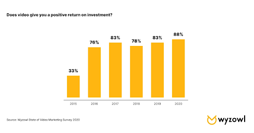
What’s more, as people pay more attention to video content, they’re an excellent way to boost your SEO rank as well as your brand awareness. You can also achieve this by mixing education and salesmanship with webinar software. Successful webinars allow you to impart useful information before you sell your product. And it’s also an incredibly effective way to pitch new products.
5. Performance Maintenance is a Must
The more changes you make to your website, the more potential for things to go wrong. This includes things like broken links, low loading speeds, and poor mobile optimization. If your site takes too long to load, no one’s hanging around for the show. If it’s longer than three seconds, 53% of visitors will leave. Ain’t nobody got time for that! But you can reduce this time by cleaning up your site and shrinking image files. Google Pagespeed Insights is a great tool for this.
Also, people now use their mobile phones to make purchases more than ever. So make sure your site is fully optimized and performs just as well as it would on a computer.
Staying on top of your website maintenance is a sure way to reduce abandonment and deliver a high-quality user experience for users. Be sure to regularly test, evaluate, and optimize to keep it that way.
6. Reward Customer Loyalty
Building customer loyalty is like gaining respect. You cannot demand it, you can only earn it. And rightly so. If they’re handing over their money and personal information, you’ve got to demonstrate that credibility and trust from start to finish.

Combining your site with an SSL certificate is a must-have feature to ensure highest security level. And when it comes to the checkout step, it needs to be simple as well as safe. That means giving them one-step checkout and making the sign-up step become optional.
Then reward your customers with some of the best retail loyalty programs to drive them back to your site again. Loyalty schemes such as these have been shown to encourage people to return and they end up spending more than one-time visitors.
7. Give a Service to Smile About
Encountering unhelpful service is enough to deter anyone from returning to a store. And this is no different online. Even when they get as far as the checkout, they’re bound to come up with sales objections that prevent them from following through.
Many of these can be prevented by improving your checkout service. For starters, make it a single-page checkout. Long-winded checkout processes, limited payment options, and mandatory registrations are a sure way to cart abandonment. Give them more choice and less work by making the process more efficient. You can effortlessly streamline this process via an order management system.

There will be time when customers need to make contact, whether it’s to make an inquiry or a complaint. So having staff on hand to deal with this is another way to ensure excellent service. This can be achieved with an online chat or a VoIP telephone service. Check out the effectiveness of how VoIP is used in business for this.
8. Craft Some Super Staff
Bringing that high-quality customer service becomes so much easier when your staff is clued up on the processes around your UX design. It not only gives customers the chance to give direct feedback but also means that staff can fully understand an issue from the customer’s point of view.
A Communications Platform as a Service (CPaaS) can help achieve this. CPaaS meaning you can deliver cloud-based communication channels such as voice, video, and SMS to your customers. And in times where training is difficult, such as when working from home, you can ensure staff are learning and collaborating more effectively via screen sharing software.

Driving Sales Through an Effective UX Design
The best way to increase sales is by giving customers what they want-great online shopping experience. It must be safe, comfortable, and easy to find what they’re after to make a fast, hassle-free purchase.
This is all achieved with effective UX design services that meets all of these needs. And once you start combining the tips above, you’ll most likely see a drop in bounce rates and cart abandonment, as your sales soar much more than ever before.