The importance of having a website that looks great and navigates well cannot be ignored in the current day and age. Online shopping is booming at the moment, and this trend has only accelerated due to the pandemic.
Therefore, you need to make sure you can take advantage of this with an effective eCommerce design.
What Is eCommerce Design?

eCommerce design refers to the process of creating an online store for your company where you can target customers online and remotely sell to them.
To design an eCommerce site involves planning, conceptualizing with the help of the latest web design trends, and arranging your products and content for successful display on the Internet, which is precisely what we will explain to you in this guide.
What does a successful eCommerce website look like?
There are several important elements when it comes to designing a successful eCommerce website, including the following:
- Responsive Design
Your website needs to be responsive, which means it will adapt to the user’s device. From laptops to smartphones, we use a wide range of devices to access online stores today, and your website must adapt to this.
- Easy Navigation
When someone lands on your eCommerce website, they should be able to navigate around it without needing to think twice. It should come to them intuitively. After all, the Internet is all about convenience. No one is going to work to find your products.
- High-Quality Images
Original, high-quality images that show off your products in the best possible light are imperative. Don’t use stock images.
- Consistent Design Elements
Consistency is critical when it comes to building a solid and recognizable brand image. For example, if you use different colors and fonts throughout your website, it will look mismatched, creating a confusing brand presence. Simplicity in design is important to maintain if you’re going for a specific look and style. Connecting a remove background API to your site can allow your products to look good without leaving your platform.
- Plenty of CTAs
CTA stands for Call To Action. You are encouraging the user to take a specific type of action, for example, to purchase a product or sign up for your newsletter.
- Designed with Mobile Users in Mind
Finally, designing with the mobile user in mind is critical. This is because Google has stated that mobile websites will be considered first when ranking. Plus, smartphones are the most popular devices used for Internet access today.
Design, Marketing & Customer Experience
Design, marketing, and customer experience must be paid close attention to and work together in unison for an online store to work well.
These elements will make or break your store. You could have the most stunning website on the web, but if no one is viewing it, what’s the point?
That’s where marketing comes in!
You could have a great marketing strategy and already have worked on your brand positioning statement, but if your customer experience is poor, viewers will quickly leave your website and go elsewhere.
This is where customer experience comes in. All three elements need to work in harmony together.
The Common Mistakes eCommerce Businesses Make In Designing Their Websites
Now that we know what a successful eCommerce site looks like, we will take a look at some of the common errors your business needs to avoid when designing an eCommerce website.
These mistakes could result in a poor performing website, which does not drive many sales.
1. Low-Quality Images

Low-quality images are bad for your e-commerce site and making sales because no one will be compelled to purchase one of your products if the images do not do it justice.

One of the biggest mistakes we see many people make is filling their websites with stock images. This does nothing to set your brand apart. It only hurts it.
Instead, you need to make sure that you have a good assortment of product visuals, which show off your item from different angles so people understand what they are buying. A photo collage is a great way to show off your product visuals from different angles. By using a photo collage maker, you can easily create a collage that highlights the key features of your product.
2. Lack Of Consistency
A lack of consistency in the visual identity, quality of images, copy, style, and tone of your website will decrease the quality and experience of your online store.
The best brands keep things simple:
- First, they have a font they rely on
- They have a color palette they use by default
- They don’t overcomplicate things
People like simplicity after all
If you use a mismatch of different style elements, you are only going to confuse people. Your brand will appear messy.
The same goes for your tone of voice. You can’t jump from being formal to acting as the website viewer is your best friend.
You need to keep it consistent throughout.
3. Too Many Pop-Ups

Pop-ups are distracting and annoying for users! Think about your own experience with pop-ups. You are browsing on a website, and you keep getting random messages that pop up and distract you from what you are trying to do.
Frustrating, right?
One place whereby there should never be any pop-ups of any nature is during the checkout process.
When someone is trying to buy a product from your website, the worst thing that you can do is distract them and potentially irritate them in the process. Unfortunately, this can often result in a lost sale.
When incorporating pop-ups into your website, you need to make sure that they are done not to take over the page and distract people from what they are doing.
Ensure they can easily be closed as well.
4. Not Enough Customer Support
You must realize how important it is for your customer to be supported throughout the entire journey.
In today’s world, we do not like to wait for help and assistance. However, if there is a problem, we want to support it right away, and your eCommerce store must provide this.
This is one of the reasons why we have seen live chat become so popular in recent times. So people can connect with others, getting the help and assistance they need.
As AI chatbots become more efficient and effective, we will see them more successfully incorporated into website design.
Still, making sure that you other several different support offerings for the customer’s convenience is critical.
5. Substandard Product Descriptions

The importance of product descriptions, which offer all the information needed, is easy to read and understand and remain faithful to the brand tone, cannot be overlooked.
If your product descriptions are weak, you will struggle to sell your products. It is as simple as that. Your product descriptions need to be informative yet clear and easy to understand.
Put yourself in your customer’s shoes.
If they are going to purchase a product from you, they want to know that they will be spending their money on the right thing.
They will not be able to make this decision if you do not provide enough information in your product description.
It is also essential to make sure that the product descriptions are optimized for the search engine result pages so that you can boost your store’s visibility.
6. Not Enough Customer Retention Effort
Many business owners today spend so much time focusing on attracting new customers to their website that they overlook just how important it is to retain your customers.
Many people would argue that customer retention is even more critical. This is because loyal customers can bring a lot of worth to your business.
Not only will they make repeat purchases, but they will advertise your company to their friends, family, and colleagues as well.
Therefore, it is advisable to put together a customer retention plan. You could set up a referral program or a loyalty scheme, for example.
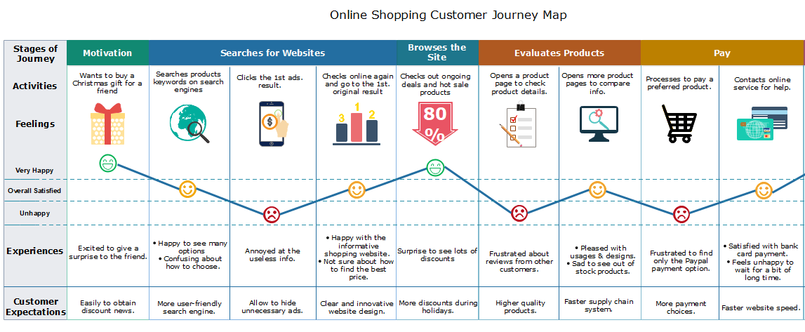
7. Confusing User Journey

Next, we have the customer journey in your online store. Again, this should be as simple and easy as possible to guide the user towards making that purchase.
A complicated and confusing user journey is one of the main reasons why eCommerce stores have a high bounce rate.
After all, if you cannot find what you are looking for, you will probably look elsewhere, right? So no one is going to spend the time trying to figure it out themselves.
This is why the user journey you provide must be easy and straightforward. People should be able to navigate through your website without needing to think twice.
Not only should you test your website yourself to make sure that this is the case, but get other people to do it as well. This can help you to unearth any sticking points that need addressing.
8. Not Enough Calls To Action
Your eCommerce website is an opportunity to use CTAs to retain customers by upselling.
Use CTAs to get them to follow you on social media, sign up for the newsletter, make additional purchases, watch out for sales, read the blog, etc.
There is an opportunity everywhere for Call To Action to keep the user on your site and engaged with your brand.
Call To Actions are very simple on the surface, but they are very effective.
You will be pointing out the obvious you are telling the viewer the steps they should take next, whether to make a purchase or refer your business to a friend.
Your CTAs should be visually appealing; they need to be bold and stand out so that people feel compelled to take action. You also need to make sure you use simple language, which is easy to understand.
9. Boring Visual Design & Branding

Your online store is an opportunity to create and share an awesome brand identity that will resonate with your target audience.
Simple brands are the most effective. However, there is a difference between clean and simple and just plain dull.
Making sure you go the extra mile with the help of some web design agencies or by hiring professionals who can help you create a stellar brand identity to bring through your e-commerce website design is crucial for sales and building and retaining a loyal customer base.
Branding experts know exactly what it takes to ensure your business stands out against all of the noise while creating a brand that is cohesive and compelling.
Think about some of the most memorable brands today; from McDonald’s to Nike. They aren’t doing something ground-breaking or complicated, but it is memorable and highly effective.
Over the years, these brands may have made slight tweaks and changes, but they have always kept things consistent, and that’s what makes them so great.
10. No Content Strategy
The importance of a content strategy for your e-commerce site that aligns and links through to your social media strategy and email marketing strategy cannot be overlooked.
Make sure your content is on-brand, adds value to your customers, and is used strategically to lead customers to the site and make sales.
One of the biggest mistakes that we see businesses make is simply creating content for its sake. When you do this, it offers no value to your business. Instead, it is more likely to hurt your brand.
Do not simply copy or repeat what is out there at the moment. Instead, think about how you can set your business apart from the rest with unique, compelling, and original content.
You also need to make sure that your content is optimized for the search engine result pages. This involves in-depth keyword research and making sure that you naturally go about this.
To conclude, these are some of the most common mistakes that we see people make regarding eCommerce website design.
However, if you can avoid these errors, you can give yourself a great chance of designing a successful website.
It is a good idea to spend some time trying out different eCommerce stores, assessing what you enjoy and what you don’t.
This will help you build up a picture of the customer journey, understanding what works and what doesn’t.