Creating high-converting landing pages can be just the ticket to increasing your eCommerce sales and website traffic. When you know what a high-converting landing page looks like, you can start planning how to use similar elements in the landing pages you create. You can use landing pages to sell specific products, grow your email list or email newsletter, offer a content download, or offer visitors a product discount or code in exchange for their contact details.
In this article, we’ll take a look at eleven high-performing landing pages from a variety of different products that can help you make more money. Before we look at those examples, here are two eCommerce landing page stats to be aware of:
- The average conversion rate for eCommerce landing pages is around 2.8%
- Only 52% of companies using landing pages also test them to find ways to improve conversions.
It’s also worth noting that if you run an eCommerce store that already has landing pages and you’re planning to move your website to a new eCommerce platform, LitExtension is available to help you migrate your existing eCommerce store to a new platform.
12 Landing Page Examples You Could Emulate
#1 Winc
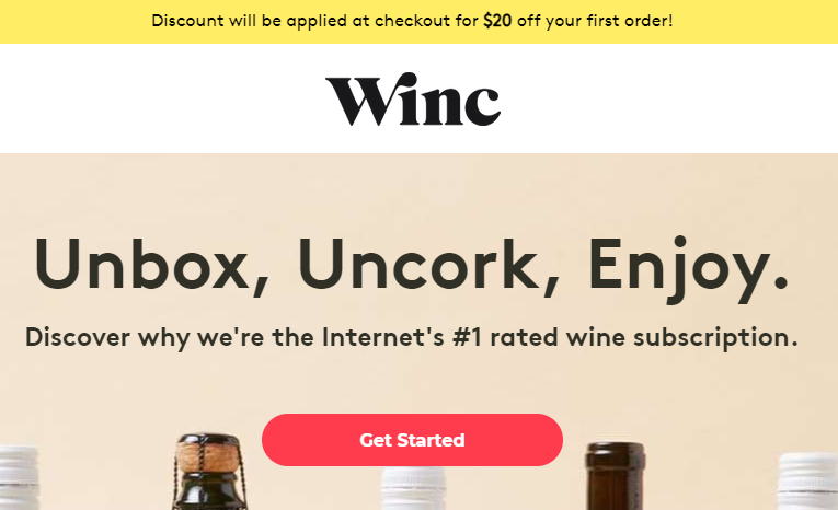
Winc is a subscription-based wine eCommerce store where customers can select a personalized box of their favorite wines to be delivered to them each month. Their landing page here contains a concise headline “Unbox, Uncork, Enjoy”. So visitors to the landing page are met with a clear CTA to click to get started with the subscription.
Besides that, Winc gives three benefit-driven features of their services as well as clear, high-quality images. This gives visitors an idea of what their subscription could look like. The discount banner at the top of the page also entices visitors to click, so they redeem their discount with their first purchase.
#2 GoPro
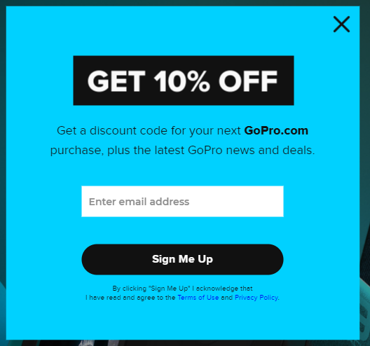
It could be argued that this GoPro landing page is more of a pop-up, but whether you define it as a landing page or a pop-up, it still contains many of the elements of a successful landing page. GoPro does a great job of enticing visitors to submit their email addresses by offering them a 10% discount on their next order. In the body text under the headline, GoPro leads with the discount code offer to hook the visitor into reading further, rather than leading with the offer of getting the latest GoPro news and deals.
The bulk of visitors who land on this landing page/pop-up are likely to be more interested in getting a discount rather than staying up to date with the latest GoPro news, so leading with the discount makes it more likely for visitors to convert. Offering a discount on the next order also increases the number of returned customers. This could significantly generate more revenue and profit for GoPro in the long term.
#3 LawRank
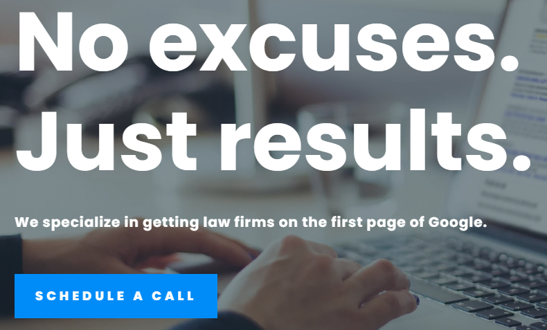
LawRank’s homepage gives a clear description in the headline and sub-headline of the service they offer while introducing its benefits. If the visitor wants to know more about how the product works, they can click the ‘watch how it works’ icon to watch a short video to discover more.
Further down the landing page, the visitor can see that LawRank has won numerous awards from different institutions, showing visitors that they can trust LawRanks service. The landing page also contains screenshots, testimonials, and guides that walk the visitor through how LawRank’s SEO service works and previous clients who have benefited from the service.
#4 Blue Apron
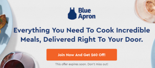
Blue Aprons landing page is simple and to the point. The headline explains to visitors what the service offers and highlights the benefit to subscribers that everything they need to cook nutritious meals is delivered straight to them. This will appeal to those visitors who are looking to save money and time with their meal prep.
The CTA button is nice and clear and uses scarcity by letting visitors know that the $60 off coupon will expire soon; this should incentivize visitors to convert quickly to make sure they qualify for the discount.
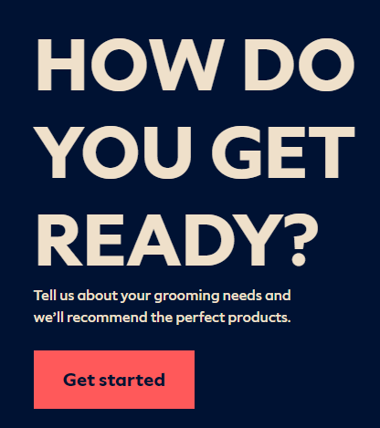
#5 Dollar Shave Club
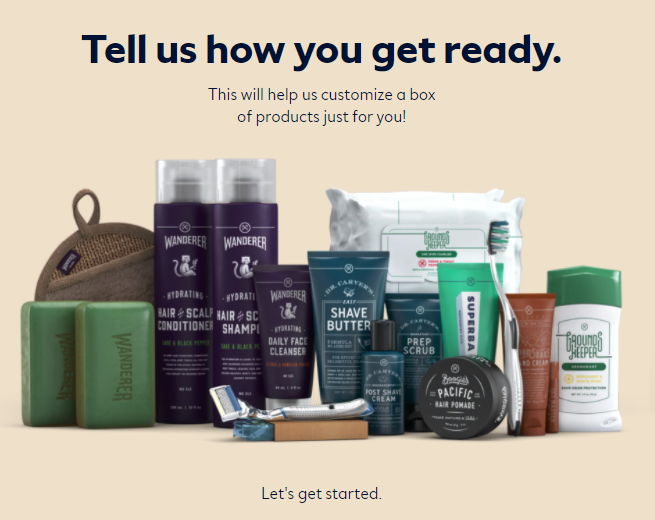
When a visitor lands on Dollar Shave Club’s homepage, they’re welcomed by a concise, attention-grabbing headline that immediately piques curiosity by asking ‘how do they get ready?’.
When a visitor clicks the CTA, they are taken to a page where they can answer a quiz to get personalized recommendations on the shaving products that are right for them based on their preferences.
This gives the visitor a more tailored experience, and they’ll be met with products that they are more likely to purchase rather than being shown products that may not be relevant to their needs and tastes, which is a win-win for both the brand and the visitor.
In addition, Dollar Shave Club gets valuable insights into the different products different visitors like, allowing them to tailor their marketing to different audiences and higher conversion rates by providing personalized product recommendations to visitors.
#6 amzpathfinder
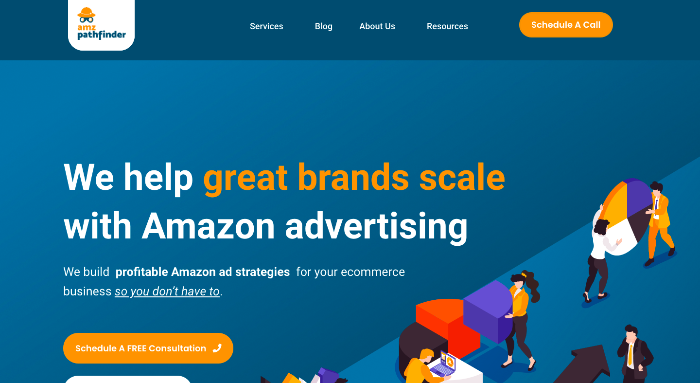
This landing page by amzpathfinder hooks the visitor’s attention with a clear, compelling headline and a free offer, which makes it difficult to turn down. By offering the visitor the chance to start for free, Beachbody gets around any price objections that visitors may have.
The subheadline also gives a visitor more information on their service.
More importantly, the visitor is shown how the service works and shown testimonials of others who’ve benefited from the service.
#7 Fabletics
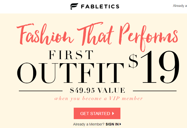
This Fabletics landing page starts off by offering visitors a large discount on the first outfit they order when they become a VIP member, this is a good incentive for visitors to upgrade to their VIP service.
Further down the landing page, Fabletics state that they have sold over 20 million products, has over 2 million product reviews, and over 1 million happy VIP members. This is strong social proof that compels visitors to convert. Fabletics have also done a great job at optimizing their conversion ratio on this page; the visitor can only exit the page by clicking on one of the pages CTA’s or closing the page completely.
Also, there are high-quality images showing people using Fabletics products. This gives visitors a clear visual representation of what the products look like.
#8 Spark People
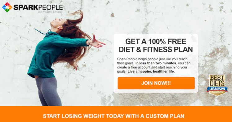
Similar to the Beach Body landing page we looked at, Spark People hook visitors by offering a free product to draw the conversion. The badge from US News next to the CTA also helps to add credibility to the offer.
Further down the page, visitors can see success stories from previous customers. Besides, there is a short interview with the founder of Spark People. This leads to further instill confidence in the visitor that Spark People’s services and products are right for them.
Visitors also have the option to download calorie counters, meal plans and personalized fitness programs. All of them all work well at giving visitors more of an incentive to try out Spark People’s service.
#9 Hello Fresh
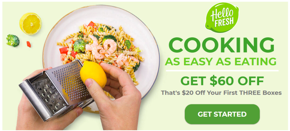
HelloFresh does a great job on this landing page of showing off a bold, simple web design that is easy on the eye. The image contains an appealing meal that entices visitors to the page to try the service. Offering $60 off further entices the visitor to click on the CTA.
Meanwhile, the CTA button itself stands out with its size and color that contrasts nicely with the background. Further down the page are given information on how the service works. Each benefit-driven feature description is accompanied by photographs of some of the meals customers can expect when they order.
HelloFresh also lets visitors know that users can skip or cancel their subscription at any time. By doing this, the visitors are under no pressure to keep the service. This landing page does a great job at explaining the service offered. Plus, they display sufficient benefits of signing up by using high-quality images.
#10 Watch Gang
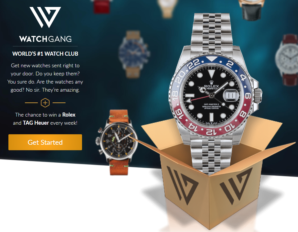
This landing page by Watch Gang incorporates a clear headline, clear benefit-driven body copy, an enticing offer and a high-quality image of the product. The headline grabs attention by letting visitors know that they’re on the page of the worlds #1 watch club. Plus, the offer entices visitors to click as they have the chance to win a premium Rolex and Tag Heuer.
The image gives the reader a good idea of the type of watch they could win. The color of the CTA button catches the eye, and the prospect of winning a watch encourages visitors to click.
#11 Business Insurance USA
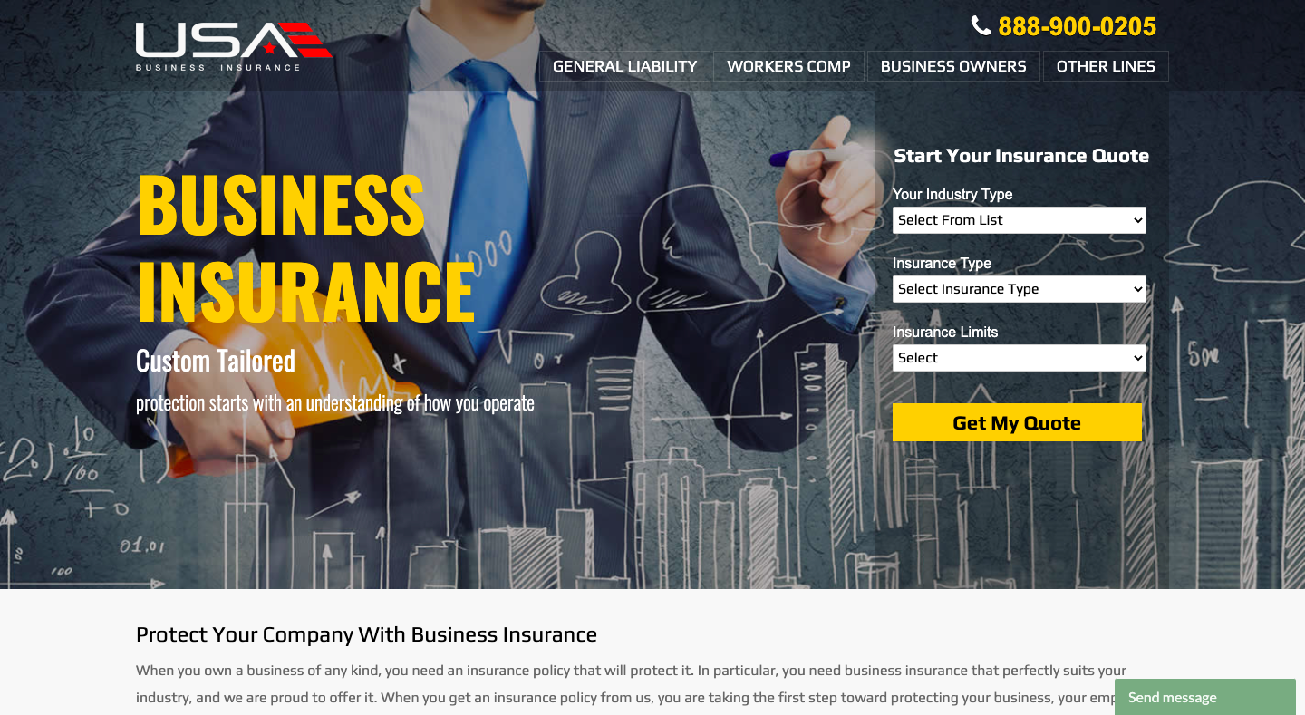
This landing page by Business Insurance USA does a great job of bringing customers further down the sales funnel.
For a high-value service such as insurance, customers are often apprehensive about pricing. Business Insurance USA allows them to get an approximate quote by simply adding in some details about their company.
When landing on the page, the visitors can go directly to the checkout page. They could either call the helpline or get a quote. The headline, sub-headline, and CTA button all contrast well with the dark background as well.
#12. DaintyJewells
As a landing page aimed at women’s swimwear, Dainty Jewells offers a great example of how to use colors and imagery to create a fun and inviting atmosphere.
The use of the contrasting image in the header is eye-catching and creates a focal point, while the use of the bright colors throughout makes the page feel fun and lively. The layout is also well-organized and easy to navigate, making it a great user experience.
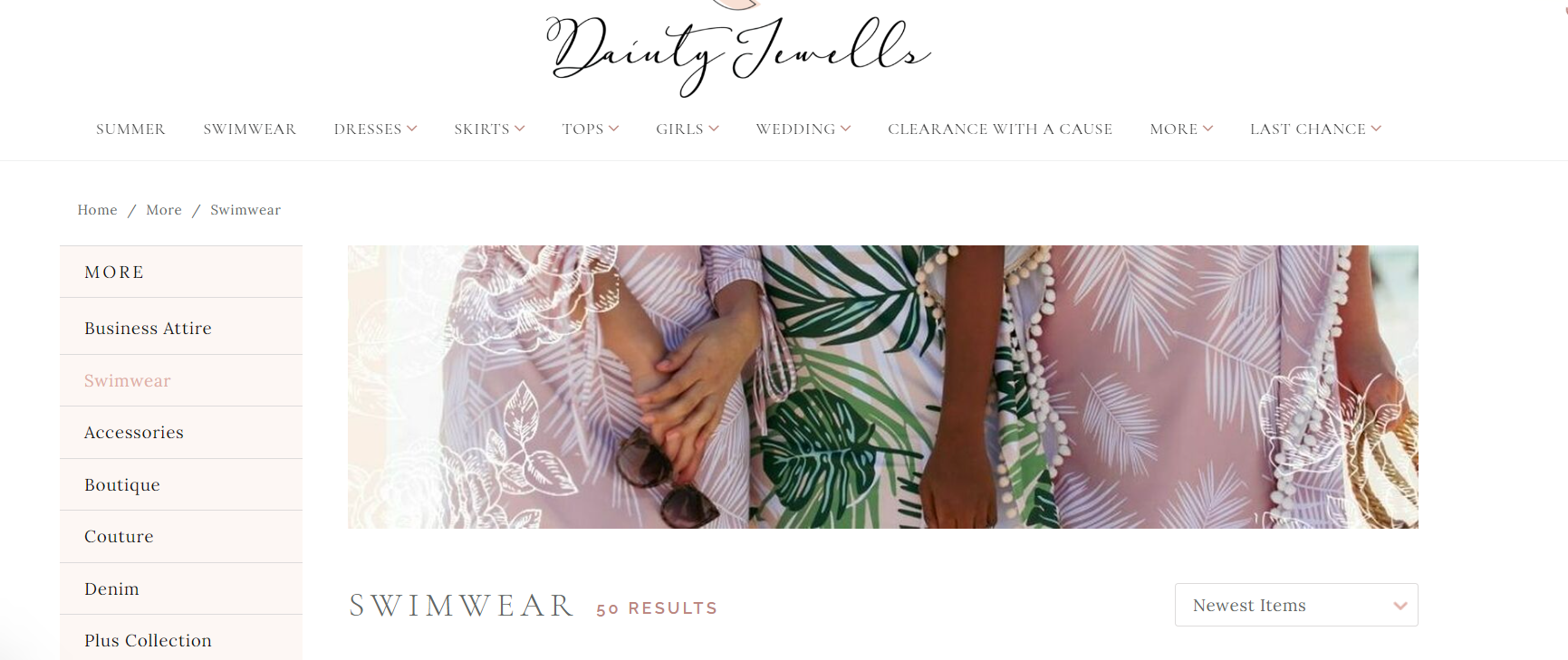
The use of the “NEW” tag also helps to highlight new products, and this is a great idea to use on topical products or to draw attention to new arrivals.
There’s also the “customer loyalty program” in the bottom left corner, which is a great way to incentivize customers to return to the site while spreading the word about the brand.
Overall, this is a great landing page that effectively uses visuals and colors to create an engaging user experience.
Have difficulties choosing a platform to start crafting your landing page? Check out our list of 10+ best free landing page builders now!
Wrapping it Up
By examining and assessing these eleven examples, there are a few common themes that stand out. First, each landing page contains a strong, clear, concise headline. This would give the visitor an idea of what the product or service is or a benefit it provides.
These headlines hook visitors’ attention and encourage them to continue reading further down the page. Most pages also contain clear images of the products they’re selling and online reviews/testimonials of other happy customers who’ve used the product/service.
With strong headlines, clear crisp images, benefit driven body copy and strong CTA’s all of these landing pages are great examples of landing pages that capture attention and drive conversions.