An unnecessarily long and complex checkout process is among the leading reasons e-shoppers abandon their carts. As online shoppers expect a fast checkout experience, any extra step or field in the checkout form can drive your potential customers away. Thus, when Shopify one page checkout was launched to all Shopify merchants on September 25, 2023, everyone is seemingly talking about it.
And we are here to discuss and answer all the questions you might have about this checkout option, including:
- What is one page checkout for Shopify?
- Is one page checkout Shopify accessible to everyone?
- Why should you enable Shopify one-page checkout?
- How to enable Shopify one-page checkout update?
- How to further elevate your Shopify checkout experience?
Without further ado, let’s dive in!
What Is Shopify One Page Checkout?
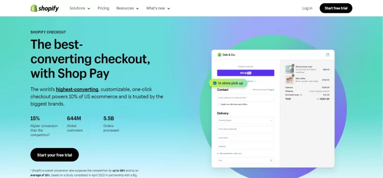
Officially launched on September 25th, 2023, Shopify one-page checkout offers your customers a more simplified purchasing experience. The new checkout enables your customers to complete their purchases on one page. It eliminates the need to move through various pages.
Shopify claims that they released the one page checkout module to shorten the path to customers’ purchases. And they believe this will help merchants reduce cart abandonments and improve their conversions.
💡 Are you new here? Well, then, we highly recommend you start with these hand-picked articles first:
- Shopify Review: Is Shopify The Crown Jewel of The eCommerce World?
- Shopify Tutorial: 9 Complete Steps to Get Instant Sales
- 30 Best Shopify Themes – Have You Got One?
Is Shopify One Page Checkout Accessible To Everyone?
Previously, Shopify one page checkout was only in the beta version, and only merchants included in Shopify one-page checkout early access could enable Shopify one-page checkout for their stores.
However, from Shopify one-page checkout release date onward (25th September 2023), the Shopify single page checkout is officially accessible to merchants of all plans.
From what we know, your three-page checkout will automatically be switched to Shopify’s one page checkout without the option to switch back (unless you are on Shopify Plus).
💡For those who are still confused about the old & new definition of checkout on Shopify:
Shopify’s three-page checkout is the former checkout process of Shopify– which consists of three pages:
- Shipping: Customers enter their shipping address and select a shipping method.
- Billing: Customers enter their billing information and review their order.
- Payment: Customers enter their payment information and complete their purchase.
And now, with the one-page checkout, Shopify consolidates the three mentioned pages into one single checkout form.
Shopify One Page Checkout: All The Pros & Cons
Shopify one-page checkout advantages
LitExtension team has been testing this new feature ever since it was released. And here are the three biggest pros of Shopify’s new checkout compared to the previous three-page version:
- Streamline checkout process: By centralizing three checkout pages into one single screen, Shopify one page checkout saves your customers from navigating back and forth between multiple pages. This saves your customers valuable time and reduces any potential confusion.
- Reduce cart abandonment: With fewer distractions along the way, customers are more likely to follow through with their purchase, thus reducing instances of cart abandonment.
- Improve customer satisfaction: The streamlined experience offered by Shopify’s one-page checkout directly contributes to improved customer satisfaction, as your customers can easily see all the necessary fields required for order completion without being overwhelmed by multi-page navigation.
Shopify one-page checkout disadvantages
Despite its several benefits, from our experience, there might be some limits to Shopify one page checkout. And since you cannot switch back to the three-page checkout, we will also show you how to overcome the setbacks of Shopify’s one page checkout module.
1. May slow down site speed.
Consolidating a significant amount of information onto a single page can lead to longer loading times, especially if the customer’s device or internet connection is not particularly fast.
💡Pro tip: Follow our Shopify page speed optimization handbook to make your checkout page load instantly.
2. May overwhelm customers.
Despite its intention to simplify, some customers may find it challenging to process all the required fields and details on a single page, leading to frustration. This is particularly true when the checkout page involves lengthy scrolling, which can further exacerbate user annoyance.
💡Pro tip: Reduce the number of unnecessary fields in your checkout form. Plus, enable Shop Pay to allow customers to check out with pre-filled data if you are valid for Shopify Payments.
3. Harder tracking.
Consolidating all information onto a single page and within a single URL can make tracking and analyzing various aspects of user behavior difficult. It becomes challenging to pinpoint the exact stage at which customers abandon their transactions, hindering the ability to gather valuable insights for future development and optimization.
💡Pro tip: Add heatmap tools to your checkout page to track your customers checkout behavior and where they are most likely to drop off.
How To Enable Shopify One Page Checkout?
Can’t wait to enable Shopify one-page checkout for your store?
Well, the good news is you don’t have to. Shopify automatically upgraded your old three-page checkout to the new single-page checkout module already.
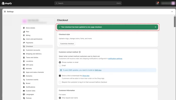
Go to Settings > Navigate to Checkout, and you will see the message Your checkout has been updated to one page checkout.
If you want to preview and customize your new Shopify checkout page, click Customize checkout button, and you will arrive at the Theme Editor.
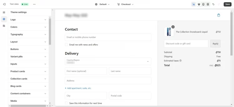
From what we’ve experienced, there is not much you can do to customize your Shopify one-page checkout. Hence, review and ensure the checkout page has all the fields you want to collect.
If you are a Shopify Plus user, simply go to the checkout editor and customize your newly upgraded one page checkout. Also, it is noteworthy that as a Plus user, you can switch back to the three-page checkout page if you wish.
💡Important note: If you are on the Basic, Shopify, or Advanced plan, your checkout will be auto-updated to the new design by the first week of October 2023.
How To Further Elevate Your Shopify Checkout Experience?
With Shopify one-page checkout, your customers can check out more easily. However, there are still many things you can do to improve your Shopify’s checkout experience further.
From our experience, here are four tips you can do to optimize your Shopify checkout page:
#1. Simplify the checkout form
Review your checkout form and eliminate any unnecessary fields– only ask for essential information like shipping and billing details.
Plus, you can try to implement an auto-fill feature to help your customers complete the form more quickly. Besides, feel free to enable address lookup tools to minimize errors and speed up the process further.
#2. Introduce accelerated checkout options
Accelerated checkout options like Shop Pay, Apple Pay, and Google Pay make the checkout process faster and more convenient for customers. It will auto-fill your customers’ checkout information, saving them time on manual entry.
Hence, ensure you allow your customers to check out under these expeditious checkout options.
#3. Leverage post-purchase upsell
If you want to improve your customers’ checkout experience and increase your average order value, we highly advise you to upsell your customers at the checkout stage by offering them product suggestions that complement their initial purchases.
For example, when a customer buys a camera, you can offer them a discounted memory card or camera case.
#4. Be clear about pricing information
Hidden costs are among the top reasons that customers abandon their carts. Hence, clearly display the total order cost, including taxes and shipping fees, on the checkout page.
And don’t forget to provide clear explanations of any discounts, promo codes, or loyalty rewards that apply to the order. In that case, you can clear up any unnecessary confusion.
#5. Add Buy Now, Pay Later options
According to Insider Intelligence, Buy Now, Pay Later (BNPL) options have been all the rage around the globe in recent years, especially in the United States.
The percentages of buyers using BNPL increased year over year in all groups
Alt: US buy now pay later user penetration report
Therefore, if you are selling high-ticket products like electronics, jewelry, high-end cosmetics, etc., we highly recommend you add BNPL options to improve your customer checkout experience.
To name a few, you can enable Shop Pay installments, Klarna, or Sezzle to allow your customers to buy your products under installments.
Shopify One Page Checkout Examples To Learn From
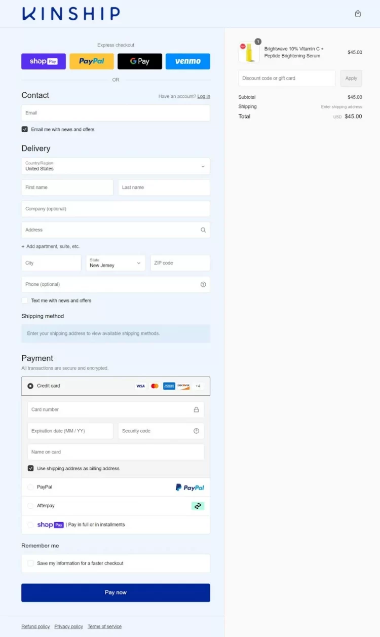
#1. Kinship
Kinship is a US-based cosmetic retailer. They are among the first Shopify Plus brands that leverage the power of Shopify one-page checkout for its promising benefits. They have a full-fledged checkout page with custom branding, express checkout options, and BNPL options.
#2. Vacation
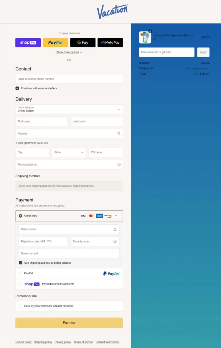
Vacation is a Shopify store selling sun-protection products. This website offers a stunning one-page checkout that we believe you can learn from besides Kinship. Their checkout page also hits all the right notes– beautiful branding paired with various payment options.
#3. Inka
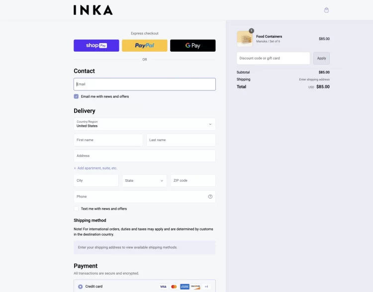
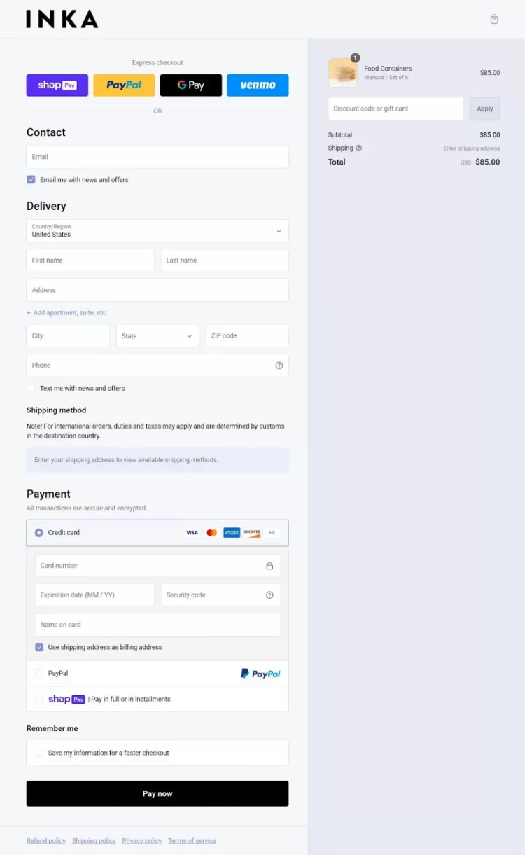
Inka is a popular brand specializing in sustainable food ware. Inka is another prime example of brand that takes advantage of the brand-new Shopify one-page checkout to improve their checkout conversions.
Shopify One-Page Checkout: FAQs
[sp_easyaccordion id=”65665″]
Final Thoughts
That’s it! After months of constant research and development, Shopify has launched Shopify one page checkout recently. Compared to the old three-page checkout version, Shopify’s one page checkout module enables customers to checkout faster, helping merchants improve their conversions.
And LitExtension hopes after reading this article, you can have all the latest information on Shopify single page checkout, how to enable it, and how to further elevate your checkout page.
Don’t forget to read LitExtension’s blog and join our active eCommerce Facebook Community to discuss and learn from 15,000 eCommerce entrepreneurs like you.