By 2040, as much as 95% of shopping will be facilitated by eCommerce. If you want your online business to have as big a piece of that pie as possible, user experience is key. It’s vital that you optimize your website. How? There are valuable user tracking tools that can help.
Why do you need users tracking tools?
It’s quite straightforward to track customers as they wander around a physical store. Staff can spot if anyone is having issues finding a product and point them in the right direction.
But how does it work with an eCommerce website? You can’t see people as they click from page to page. And it’s not possible to chat in-person about their shopping experience. It’s harder to identify what customers want or understand why they behave in a certain way.
That’s where user tracking tools come in.
User behavior defined
It’s pretty simple: all the actions visitors take when they load your eCommerce site. Where do they click, and what on? How do potential customers navigate around your website? What pitfalls do they experience? At what point do people leave entirely, and why?
The behavior of customers is important. Tracking tools allow you to gather data on them. Evaluate the information you collect when your visitors browsing website vis desktops or mobiles through user behavior analytics tools (UBA). And find answers to the questions we just posed.
Armed with valuable insights into the customer journey, it’s possible to grow and improve your business. To take corrective actions and optimize your conversion rate. Statista forecasts that e-retail sales will reach 22% in 2023. Get in on a slice of that action by scrutinizing consumer behavior.
Read on for five user tracking tools that will help your eCommerce business grow.

1. Session recordings
View exactly how customers move around your website with this popular method. Get an idea of how users are engaging by monitoring every movement, click, tap, and scroll. With this wealth of data, you’ll be able to tell how each webpage is performing. Powerful, right?
What if every element apart from your call to action (CTA) button is working well. Then make it bolder, larger, or change the design.
Let’s take a business that allows customers to create digital brochures as an example. The landing page of the website has two CTAs. Session recordings can identify if one of these is broken.
Get to know how visitors feel about your enterprise. See what they like and dislike. You may want to redesign sections based on that. Revamping can lead to other benefits, too, by boosting your reputation through word of mouth.
Session recording can also be used to determine what parts of your site customers prefer. Is there a particular type of content they favor? Increase traffic by incorporating more of it.
What’s more, this approach can help pinpoint problems with your setup. And reduce shopping cart abandonment, too. Lengthy checkout processes, high shipping costs, or limited payment methods may be contributing.
By capturing mouse movement, you mirror the customer. You can empathize with them and see issues and bugs first-hand. There may be a technical factor that needs resolving; loading times may be too long. Iron out, and see bounce rates fall. Consider introducing automation technology to save time and money further, too.
Analyze, correct, and raise the conversion rate.
2. Heat maps
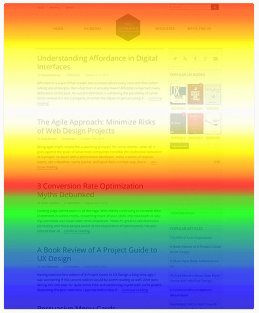
This technology highlights where visitors spend the most time. Not only that, but where they’re clicking. They’re a data visualization technique that uses color to understand complex information. Use this method to diagnose the most and least popular elements of a webpage. View results at a glance, and use them to identify trends.

Establish which CTAs are working, and which buttons perform best. Are users buying a product, signing up for your newsletter, or heading for the checkout? Are they downloading a demonstration, requesting a price, or adding to the cart?
Let’s take virtual phone systems as an example. Firstly, what is a VoIP provider? An organization that offers Voice over Internet Protocol services to consumers or businesses.
Companies selling this product want prospective customers to click a button for a demo or to get a quote. Use a heat map to analyze whether that’s happening.
There are different types to consider. Each helps with different aspects of your website performance. Scroll maps give you the percentage of potential customers who move down to any point on the webpage. The redder a section is, the greater the number of visitors who saw it.
Click maps calculate aggregates of where people touch their mouse or tap their mobile. The results are color-coded. Move maps record where users navigate to a given page. It’s thought that wherever the cursor is, users are looking there.
Remember to take desktop versus smartphone into account. Content that’s front right and center via one medium may be much less prominent on the other.
Utilize this visual tracking tool to raise awareness of where visitors engage. Then fix problematic areas.
3. Feedback widgets
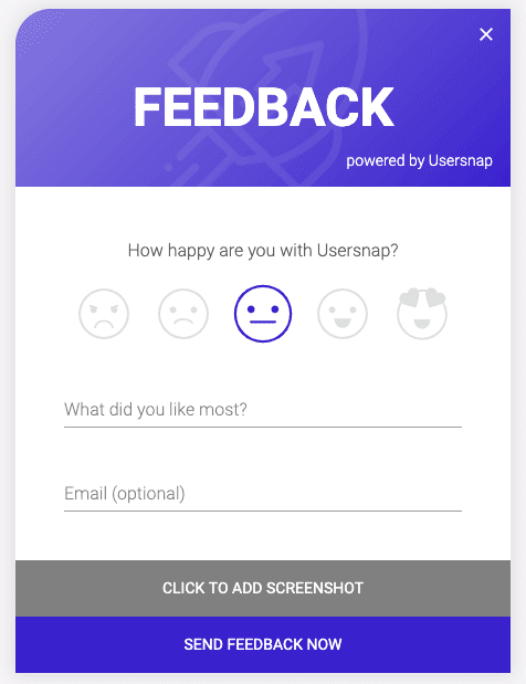
Obtain hyper-targeted visual observations with this mechanism. For individual pages of your choosing, see what customers like and loathe. Use emojis to symbolize what’s working and what’s failing. Customize pop-ups and add a message.
Widgets are also a way to encourage users to get in touch with your customer service team. Not just with questions, but problems too. Allow people to attach screenshots, giving contact center agents more information. This increases their chances of solving the query.

While we’re on the subject of contact centers, manage your team with a workforce optimization system. Use it to implement best practices. And aim to provide a first-rate service. Top tip: bolster efficiency and productivity with a TCPA compliance dialer.
4. On-site surveys
Hone in on specific areas of your eCommerce website by asking visitors what they think of them. Analyze feedback and use it to improve the site. It’s an easy and quick way to find out what’s working and what’s suboptimal.
And the sort of questions you should pose? Anything from ‘What do you think of this webpage?’ to ‘How would you rate your experience and why?’.
This direct method can help you single out irksome pages that aren’t user-friendly. Gain a greater understanding of what customers like, and what they don’t. Figure out what steers people your way, and what they think when they get there.
Find out how they heard about your operation. And how likely they are to recommend your website to others on a scale of 0-10. Then ask for a follow-up to gain extra insights. Something like: ‘What could we do to improve that rating?’
If customer experience is negative because of a weak support service, what can you do? More training and better systems may be required. Research the best call center software 2023, and make an investment.
Analyze feedback and use it to improve the site. A survey maker can help you with collecting feedback – it’s an easy and quick way to find out what’s working and what’s suboptimal.
Equipped with a host of info, discover where to focus your efforts and how to improve conversions.
What’s more, on-page polls let customers know they mean something to you. When a person walks into a physical store, they’re greeted by a salesperson. There’s a human connection. Achieve something similar with your online shop by asking questions.
Show you care.
5. A/B testing
Businesses want potential buyers to become actual customers. Correct? You want visitors to your eCommerce site to take action. A final technique to help ensure that happens is comparing two versions of a page and measuring the difference in performance.

Use this competition method, and see which variation wins.
Identify what wording, content, and images produce the best results. And remember, even the simplest of changes can yield a positive outcome. For example, the color of a CTA button. Based on 2,000 webpage visits, one experiment showed that a red call to action outperformed a green one by 21%.
If a customer is in the market for Mac small business software, does a website perform better if there’s a YouTube video embedded on the page?
We’ve left this method until last because it works best if you base each test on data collected from tools one to four.
Analysis is king
Now you have the techniques, what should you do with all the data? Examine it, make observations, take action and create your unique e-commerce strategy. Set goals for yourself. If you currently achieve 1,000 conversions per week, be realistic with your future expectations. Don’t expect to catapult to 1,000,000. Tackle one aspect of your website at a time, so you can monitor the impact of each change.
User behavior matters
To get to grips with it, apply the right processes. User tracking tools are your friend and can help. It comes down to this; if customers don’t like your eCommerce website, they’ll leave and go elsewhere.
Do all you can to turn potential customers into actual ones with five strategies: session recordings, heat maps, feedback widgets, on-site surveys, and A/B testing. Improve user experience, optimize the conversion rate, and grow your business.