Today, online shopping has become the new norm, especially since the COVID-19 pandemic in 2020. Anyone trying to sell a product or service is forced to turn to eCommerce to facilitate their business operation.
Ecommerce websites provide an opportunity to establish a brand, engage with more clients, and, as a result, sell more goods. This, however, only occurs if the website is well-designed.
Good visual design‘s purpose is to make many sales by relying entirely on your business brand. Considered web design features and bold statements will pique the interest of potential customers and encourage them to discover more about your business. A good website with a nice design motivates consumers to take action and establishes brand confidence.
But it is difficult to say what a good website design is. It often depends on the specific characteristics of your business and your target audience. Partnering with a web design company can provide valuable insights. There are no concrete rules for how you should design your pages. However, there are a few universal tips and techniques that work for everyone.
Web Design Tips for eCommerce Stores
Keep your website simple
Simplicity is the ultimate sophistication. A simple website design seems more elegant and allows users to scan what your company is about easily.
Most people will not waste time looking for information on a website that is cluttered and disorganized.
When creating your website design, it is important to critically plan where you will place your menus to avoid cluttering and losing potential clients from your landing page. One way to do it is by getting feedback on it from your team members, subject matter experts, and other stakeholders. If you use an online proofing tool, you can get all their feedback in context, on one platform, and tick them off one by one.
Websites with simple designs are regularly perceived to be more reliable and appealing than complex ones. Web designers should eliminate extraneous details and employ minimalistic design with enough white space.
White space is between design elements and is a useful tool for enhancing user experience (UX).
Having a simple design gives your users a clear direction in terms of navigation. They can easily see where to get specific information and spot the information they are looking for in the minimum time possible.
Use clear and attractive images
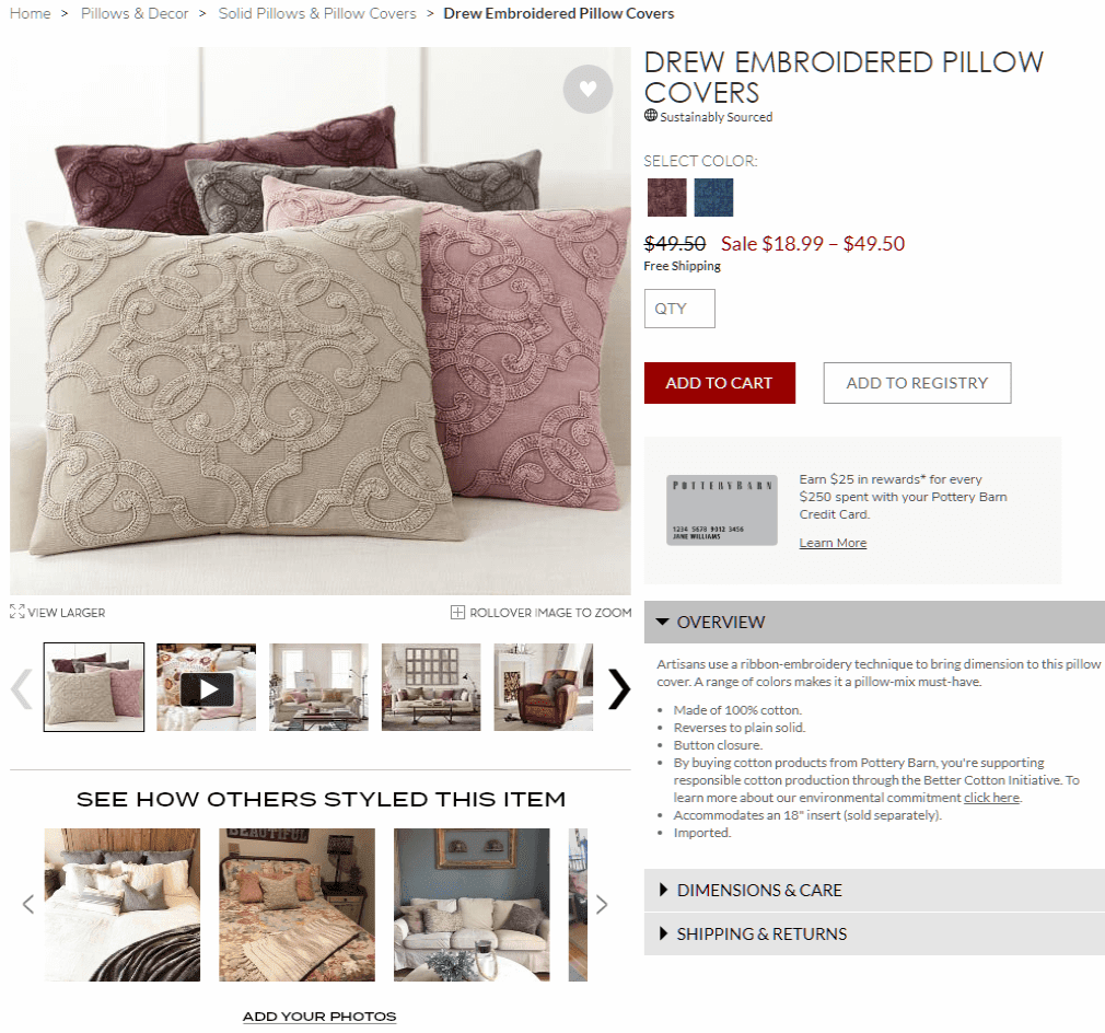
A major drawback of online shopping is that users cannot touch and feel the products when they go into a store. Photos and descriptions on your website, therefore, guide them. As a result, the photos must be of good quality, with the option to examine them in the original resolution, in a significant number of views from various angles, and possibly in various usage scenarios.
Web design is all about visual stimulation. The quality of the photos on your website communicates a lot about the quality of your brand. Blurry images make the products look cheap and not of great quality.
You should invest in professional photography for your products and use these on your website. You should also provide zoom options to allow your clients to view the products in detail before purchasing.
At a glance, people are more likely to click on attractive images to see more about the products, translating to a purchase. The images you should use should be focused on the product. If it is a shoe, the background should be neutral, preferably white, to avoid distraction.
Enhance user experience
The main reason people go for an eCommerce website is convenience. No matter the product you sell, if the navigation on your website is cumbersome or purchasing products is a painstaking process, the clients will probably not come back.
One way of enhancing the user experience on your website is to make the processes in your website flow from one step to another. If the client has to buy a product, it should guide them from selection to payment as a single process.
Having your brand logo linked to the homepage also aids in easy navigation for your clients. Along with the brand logo, the search bar is always in view. It allows users to search for anything in any category without case sensitivity.
Use appropriate colors depending on your field
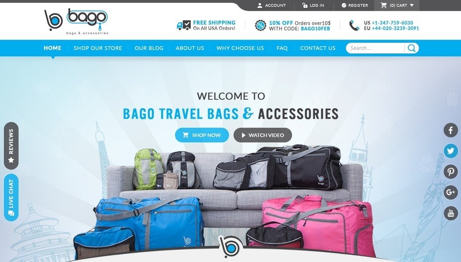
Long before eCommerce and online shopping, colors and shades have been used to impact customers psychologically, increasing sales. For instance, purple and its shades give a website a luxury, royalism, and tranquillity look.
Consider the qualities of both your product and the representations of the target audience when selecting a color that will provoke specific feelings and emotions. If you’re a medical company or selling medical products, maintaining a white color gives an impression of cleanliness and positivity.
Remember SEO best practises
Using SEO tools in your eCommerce website is key. It will give you more exposure to potential clients and thus generate more sales.
SEO tools revolve around three main points: using the relevant keywords multiple times, writing smart product descriptions that are precise and easy to read, and taking advantage of built-in SEO tools that come with website builders.
Encourage user-generated content
Using user-generated content is a great social marketing tool. Encourage your clients to post content about how much they enjoy your products or services and share it with their friends.
Provide incentives like discount coupons for your customers to generate and share this content on their Instagram, Facebook, or Twitter postings with information about their experience and tag your eCommerce site and social media pages.
Use creative digital interpretation of your products
Having high-quality images on your website will boost your sales. Adding digital interpretation features will give clients a closer look and also make your brand look professional.
Being able to view the images from different angles and in closer detail might increase your sales. Video reviews or 3D models can also be used to demonstrate the worth of a product and its usefulness and performance.
A pop-up box is another useful feature that allows users to zoom in on a certain product and see as many small details as possible.
Show product scarcity
Showing that a product is out of stock implies that it is of great quality and that many people want it. You can also prompt them to add it to their wishlist and have priority when the product is in stock.
The scarcity of items can be used in manipulating users’ psyche. As a result, people will hurry to buy a product because they are afraid it may run out of stock soon, resulting in impulse purchases and consequently increased sales.
Be transparent
When designing your website, you should put a clear link to your store policies in your navigation. It would be best if you never deceived your clients. People are more likely to go for a company that reveals price information and return policy conditions clearly.
Having a reviews and testimonials page is also a step towards honesty for users. Users are more likely to trust your company after reading reviews and testimonials from your previous customers.
You should also include your contact information and handle it properly and professionally in case of a dispute.
Keep it professional
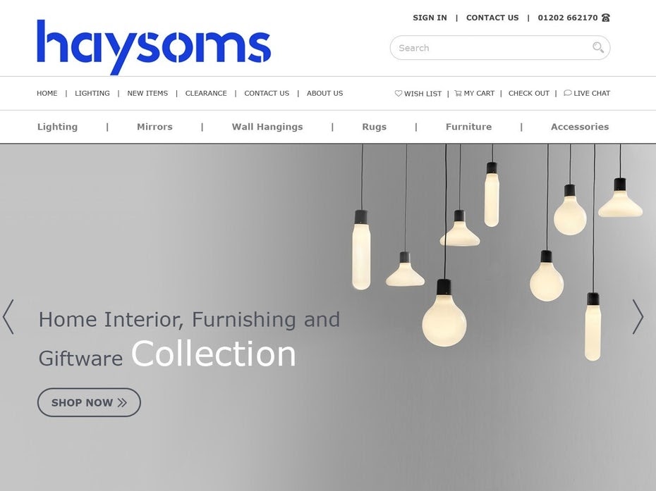
Professionalism in web design comes in many forms. A simple yet informative and organized design displays professionalism. The language used also shows how professional your brand is portrayed. Terms should be professional and understandable to clients, similarly to how the brand activation technology is conducted.
The design can cater to advertisements of other companies and their products but not in a way that puts off your clients. Pop-ups shouldn’t interrupt clients, constantly reminding them to take advantage of offers.
Avoid too many offer Pop-Ups
Many companies make the mistake of bombarding users with too many offers while trying to buy one product. This technique is off-putting, and most users would exit the website due to the pressure.
The easier it is for a consumer to find the thing he wants, the more time he has to acquaint himself with the product’s description, and the more likely he is to buy it.
Use storytelling
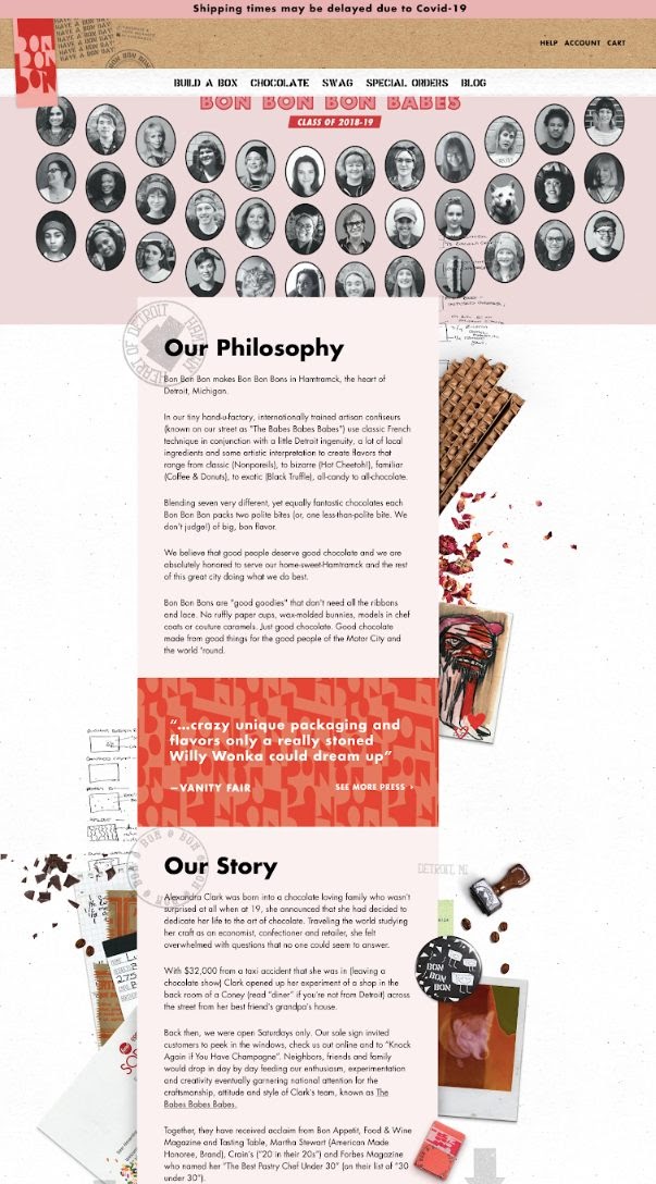
Having a great story around your brand will make it more memorable to your clients. Anyone can run an eCommerce website. A website designed around how the brand came about feels more personal and honest.
Storytelling is a marketing tool. You must tell a captivating story if you want to build a quality brand with a positive image. Customer loyalty is increased through storytelling. Furthermore, if consumers believe in your genuineness and uniqueness, they are more likely to remember your brand.
Prioritize ecommerce security
The complexity and frequency of cyber attacks have doubled in recent years. For this reason, it is important that your website protects payment and customer information. An SSL certificate from a trusted provider is required.
Visitors to your website generally look for the green lock and HTTPS flag in the address bar before entering their payment information to complete the transaction. Then, add your SSL secure purchase icon to the shopping cart page.
Other things to put on your website are: two-step authentication (e.g. fingerprint, OTP, security query), a firewall to block unauthorized traffic on the website, and a link to your privacy policy, a note to footer that clarifies who you are. doing. Do not share the client with third party websites.
You can also increase the credibility of your e-commerce stores by displaying safety posters on the website. Research shows that 76% of respondents will not buy safety signs on the website if they cannot see them. Then choose the most recognized companies like McAfee, PayPal, TRUSTe and Verisign.
Make it responsive
Many users log into your website with their phones. If your site is not set up to respond to mobile devices, you will immediately lose this customer group. For this reason, our main goal is to keep your shop responsive.
A good website builder will automatically convert your website to a mobile template to ensure this. This is especially useful for ecommerce sites, as it is completely online. You want everyone to have the same opportunity to buy from you.
Be honest about pricing
Honesty is the best policy! When designing an e-commerce website, always try to be honest about the cost of the services or products you offer or the e-commerce marketing tools you use. Don’t try to hide information or disturb your website visitors.
You never want your viewers to feel betrayed or destroyed. Hiding pricing information on hard-to-find pages on your website can be harmful. Instead, position it in a way that is easy to see and understand.
Use A/B testing often
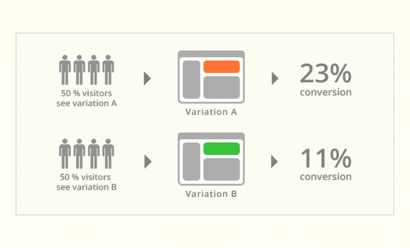
A / B testing is necessarily a way to use two different website designs at the same time. A is one version and B is another.
After a while, you can compare the stats for each version separately. The criteria you can review include the conversion rate, ease of use, and overall participation in different parts of the plan.
Even a simple design change can greatly improve user interaction. Likewise, experimenting with different color variations and more can give you a much clearer idea of what to focus on in your future projects.
Use social proof
When designing your ecommerce site, look for ways to show potential customers the positive feedback you have received from your current customers. Add a reviews section where people can rate your products (and thus get reviews up to 5 stars). Add a description section where you can see customer photos with a quote or two about the great experience with you. Ask customers to rate your products and what they like about them, then add them to your blog.
The more visitors to your website see that other people have had a positive shopping experience on your website (through reviews or testimonials), the more credible it will appear and the more conversions you will get.
In a Nutshell
The fundamental goal of developing an eCommerce website, much like real sales, is to do everything for the customer’s satisfaction, not merely sell items and make money.
The world of web design is a tremendously turbulent place. If you consider patterns, customer behaviours, and current trends, you will acquire a competitive advantage and increase sales.
If you’re thinking of coming online or giving your website a makeover, follow our advice, and you’ll be set.
About the author
Rithesh Raghavan is the Director at Acodez, a Digital Agency in India. Having a rich experience of 15+ years in Digital Marketing, Rithesh loves to write up his thoughts on the latest trends and developments in the world of IT and software development.